Rethinking Creative Comparison
Client
Neurons / Compare Mode
Year
2025
Redesigned the Compare View experience to support deeper asset evaluation workflows using Neurons Impact Score and Impact Scores as the primary comparison framework. The project transformed Compare View from a fragmented metrics table into a structured decision-making tool aligned with the platform’s newer analysis model.
Scope of Work

Problem
Compare View had gradually fallen behind the rest of the platform.
While newer product initiatives introduced the Neurons Impact Score (NIS), Impact Scores, prioritized metrics, and simplified Overview workflows, Compare View still relied on an outdated comparison model centered around raw metrics.
This created several structural issues.
First, the feature no longer aligned with how the platform framed decision-making elsewhere. In the folder view, we already supported shallow selection workflows through NIS, allowing users to quickly identify the strongest-performing asset without deeper analysis. Compare View therefore lost clarity around its purpose within the ecosystem.
Second, the comparison experience itself lacked a coherent hierarchy of information. Users were exposed to dense metric displays without clear guidance on what mattered most when evaluating multiple assets. The system provided comparison capability, but not comparison logic.
The page also accumulated significant interaction complexity over time. AOI editing functionality introduced substantial UI and technical overhead despite extremely low usage. Comparison workflows became harder to scan, harder to maintain, and less focused.
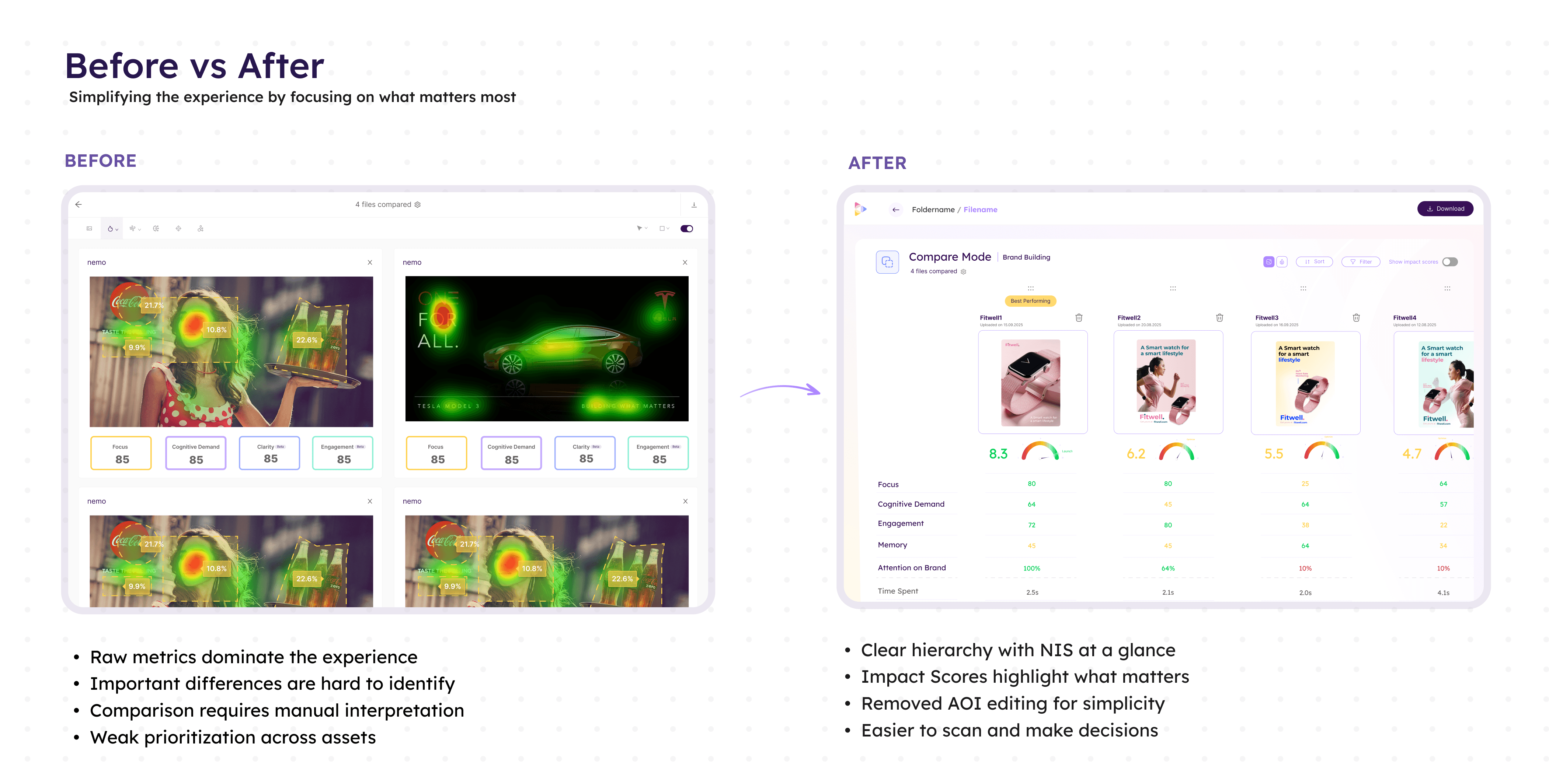
In addition, the introduction of NIS exposed inconsistencies across assets with different purposes or missing metrics. Without stronger validation and contextual guidance, users could unknowingly compare incompatible assets or misinterpret scoring differences.
As the rest of the platform evolved toward guided interpretation and simplified decision-making, Compare View increasingly felt disconnected from the product’s core analytical model.
Insight
The role of Compare View had fundamentally changed.
Users no longer needed Compare View for quick asset selection as Folder View and NIS already covered that use case effectively.
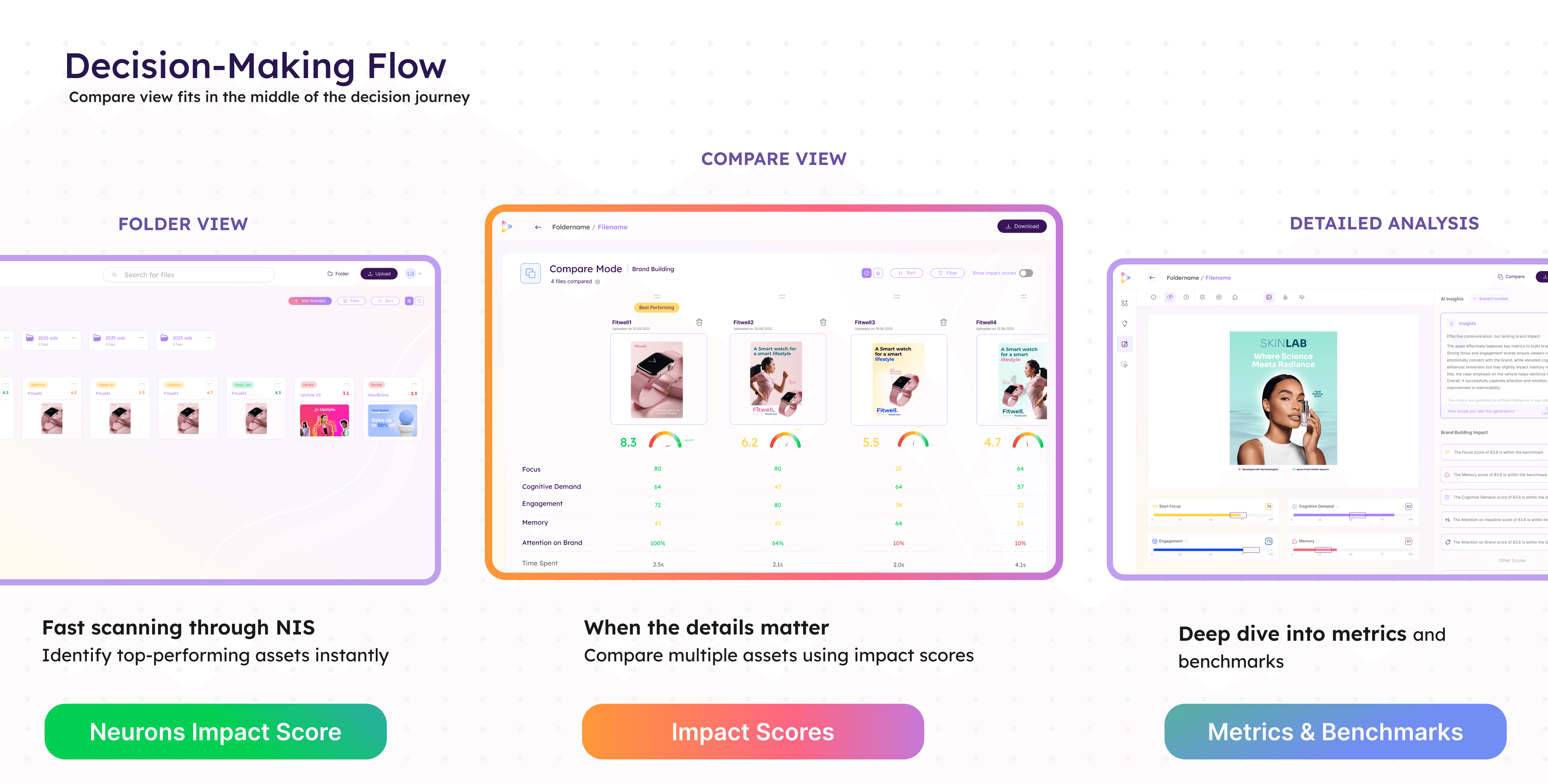
Instead, Compare View became most valuable when users needed decision confidence. Its purpose shifted from “Which asset scored highest?” to “Why are these assets performing differently, and which tradeoffs matter?”
This reframed the experience around comparative interpretation rather than raw analytical depth.
Users did not need more metrics on screen. They needed a comparison system that surfaced meaningful differences, contextualized scoring, and reduced ambiguity between closely performing assets.
Approach
The redesign repositioned Neurons Impact Score as the primary comparison dimension.
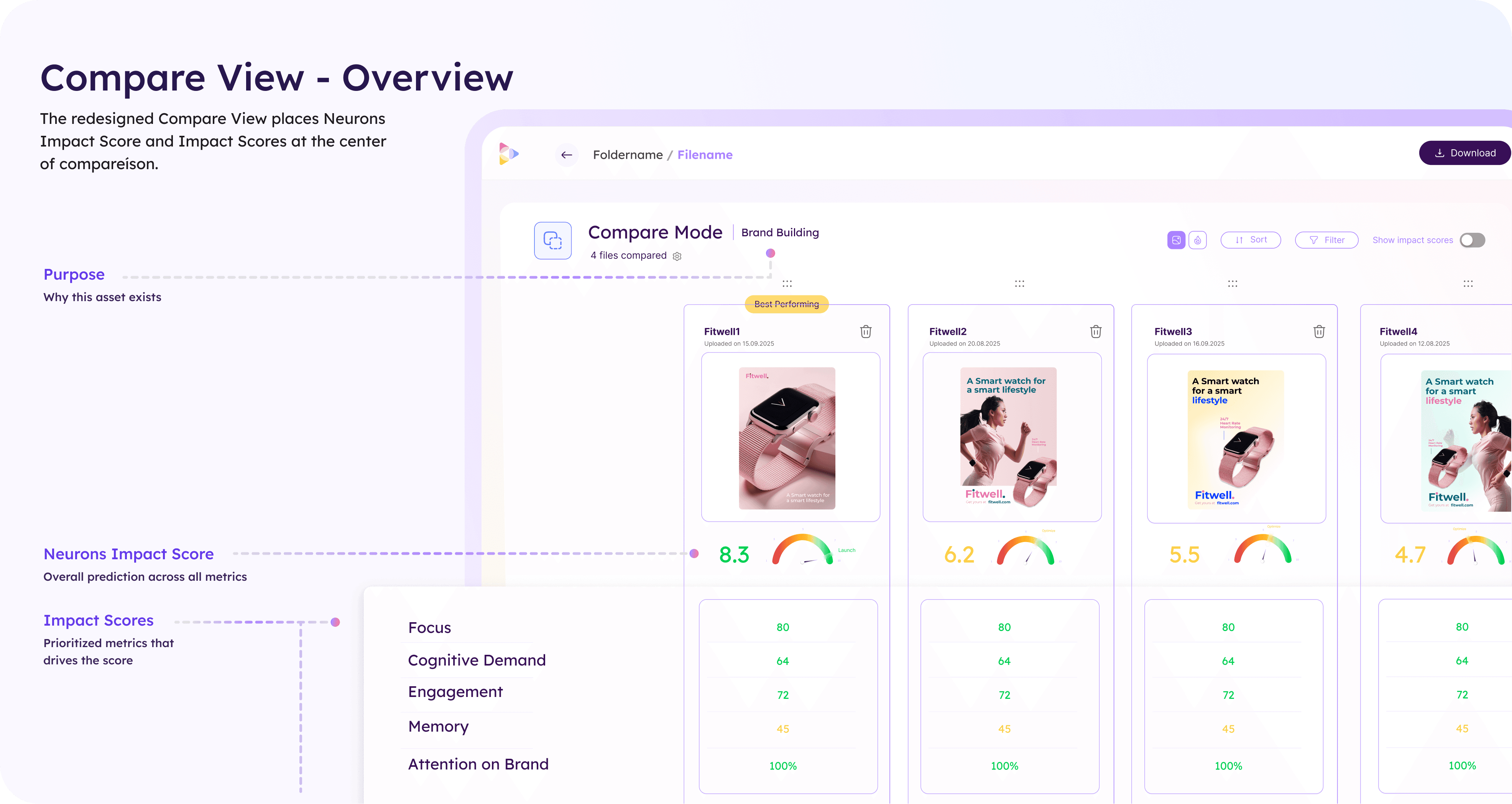
Rather than presenting large sets of disconnected metrics, each asset was structured around:
NIS
prioritized Impact Scores
contextual asset information
This created a clearer comparison hierarchy:
high-level selection through NIS
deeper evaluation through Impact Scores
granular exploration only when necessary
The system aligned Compare View with the broader product ecosystem while preserving analytical depth for users who wanted to investigate further.
Comparative decision framework
A major focus of the redesign was helping users understand meaningful differences between assets.
To support this, the experience introduced:
purpose-aware comparisons
warnings for incompatible comparisons
visibility into missing metrics
comparative sorting by individual Impact Scores
This transformed comparison from a passive side-by-side layout into an active analytical workflow.
The system also introduced contextual safeguards. Assets with different purposes or incomplete prediction sets surfaced explicit warnings to prevent misleading comparisons.
Progressive comparison workflows
The experience was redesigned around progressive evaluation.
Users could:
quickly scan overall performance through NIS
narrow analysis through prioritized metrics
sort dynamically by specific Impact Scores
investigate deeper only when necessary
Sorting became a core interaction model rather than a utility feature. Instead of static side-by-side comparisons, users could reorganize assets based on the dimension most relevant to their evaluation goal.
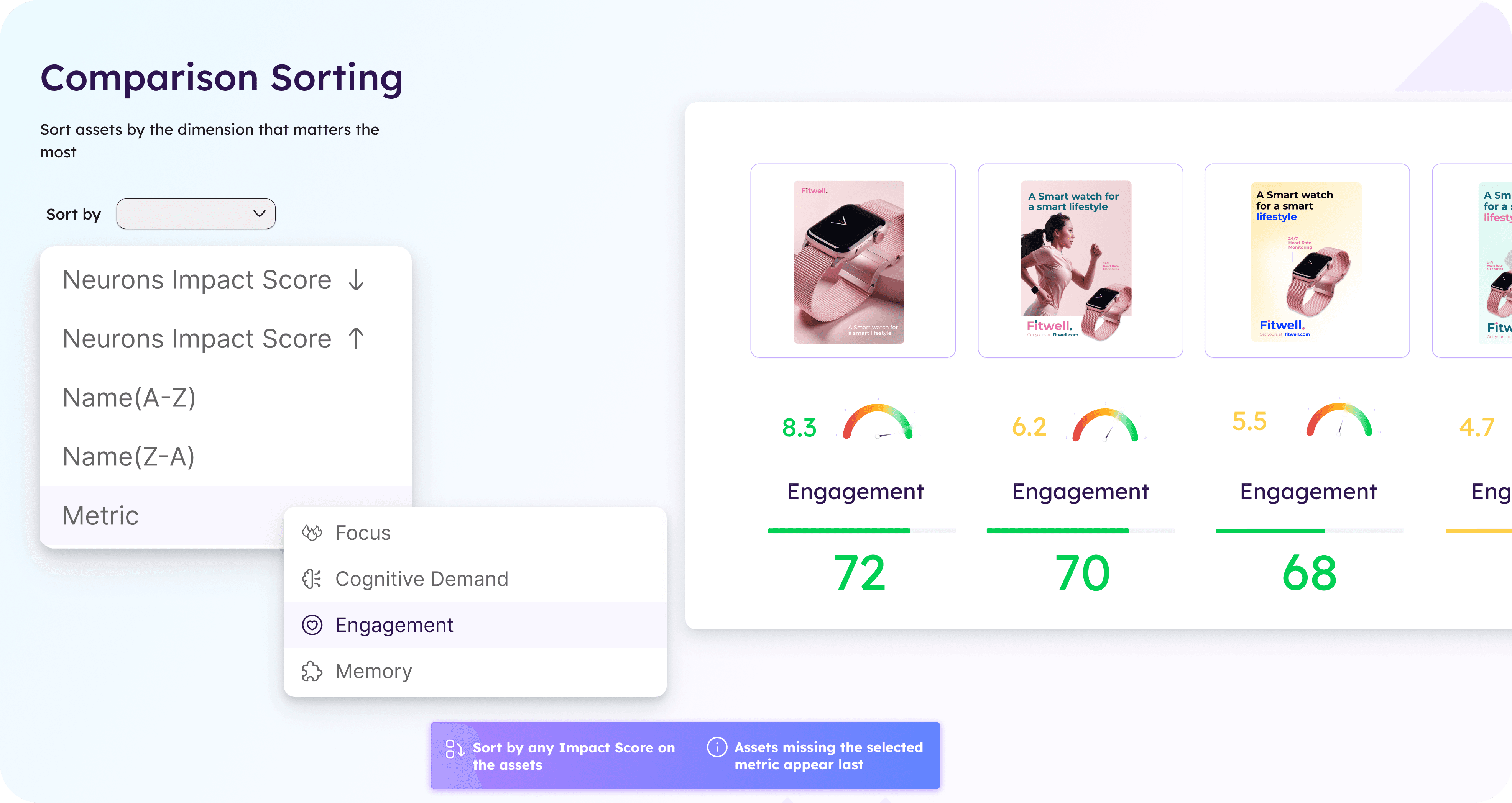
This significantly improved scanability and reduced cognitive overhead when comparing larger sets of assets.
Simplification through feature reduction
The redesign intentionally removed AOI editing from Compare View.
Although technically powerful, the feature introduced disproportionate complexity relative to actual usage(7% out of all AOI events were made in Compare View in the past 6 months). By removing editing workflows from the comparison experience, the page became:
simpler to navigate
easier to maintain
more focused on evaluation rather than manipulation
This allowed the comparison workflow to concentrate entirely on interpretation and decision support.
Key Decisions
Centered the experience around NIS and Impact Scores
Replaced fragmented metric comparisons with a structured scoring hierarchy aligned with the broader platform.
Introduced comparison-aware validation states
Added contextual warnings for mismatched asset purposes and missing metrics to improve decision reliability.
Removed AOI editing from the comparison workflow
Simplified the experience by eliminating low-usage editing functionality that added significant interaction complexity.
Outcome
The redesign repositioned Compare View as a focused decision-support tool rather than a dense analytical workspace.
By aligning comparison workflows with the platform’s scoring model, the experience became easier to scan, easier to trust, and more coherent within the broader ecosystem. Users could move from high-level asset selection into progressively deeper comparison workflows without losing context or interpretability.
The redesign also reduced UI complexity substantially by removing low-value interaction patterns and introducing clearer comparison logic.
Key outcomes included:
improved comparison clarity across assets
reduced cognitive load during evaluation workflows
stronger alignment with NIS and Overview experiences
clearer handling of incompatible or incomplete comparisons
simplified interaction model and maintenance complexity

